Meet the new NERGC 2019 app
You’ve seen it in my previous posts…I love it when genealogy and technology comes together. So, I was very happy to see that one of my favorite genealogy conferences, New England Regional Genealogical Conference (NERGC) had promised a conference app for NERGC 2019 which is taking place in Manchester, New Hampshire this week. I think that’s a pretty big deal for a regional conference to embrace, and fund, something that they know folks are wanting.
I downloaded the app immediately when they released it last week and I think for a first time out, this app has some nice features.
The Interface
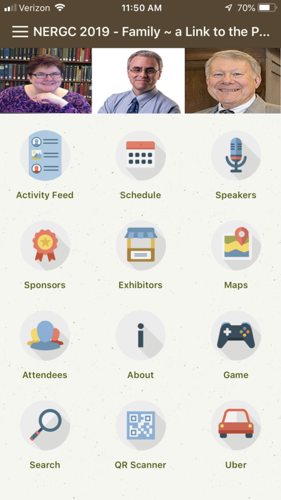
I think the home page looks clean and simple – which I like. The only thing I would suggest is to perhaps work on the aspect ratio of photos in the banner like the one with Cyndi Ingle, Blaine Bettinger and Dr. Thomas Jones. Sizing can be a tricky thing and even if they need to put a sold background color with smaller photos of the three of them, it would look better. But I like that they used photos here. It lets you know immediately who are the main featured speakers. From a design point of view, I’m not a big fan of the rainbow banners announcing future NERGC dates. But that just might be me. I liked in that same banner area was listed what door prizes each booth are offering. I know I’m a stickler for design stuff but I wasn’t a big fan of the fonts and colors that were used, but I’m guessing they wanted things to stand out and be distinctive. I’m just a bit of a purist and I like simple fonts, simple colors, etc. Not everyone will share my feeling.
The Schedule
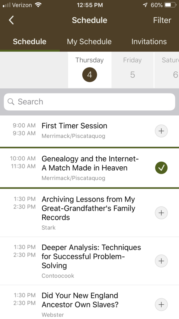
I live in two worlds right now. At times I still like a printed schedule. I still take my pen and circle what I’m interested in. But then I go onto the app and make my choices because, quite honestly, I’m not going to dig my printed program schedule out of my bag. But I always, always have my phone in my hand or in my back pocket (jeans are essential wear for conferences for me, for this reason alone). I frequently tweet while I’m in a session. I like to share key points a presenter makes or just let folks know what an awesome session this is. When I leave a session, I want to see immediately where I’m going next. This, alone, makes the app worthwhile for me. I wasn’t able to add a session within the app, though. Which was puzzling. I kept getting a message that the registration was closed for that session. Apparently only the things you signed up for during your original registration are going to show up on the app. So that was a little frustrating. But I loved being able to see the overall conference schedule and see my personal schedule all under the schedule icon. Maybe adding sessions from within the app is something they can tweak.
Activity Feed
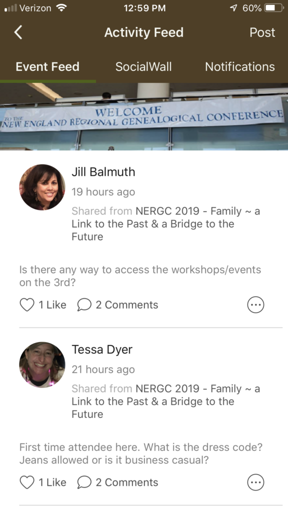
I like this feature. Under Event Feed, you can talk just with folks who are attending and have a profile. I like the idea of being able to talk in a private feed about the conference. You can also connect to your social media, which is what I’m assuming is what will happen under the Social Wall here? That won’t activate until the conference starts, I’m guessing. But I’ve already made connections because of this and the conference hasn’t even officially begun.
The Usuals
I’m happy to see that this app includes pretty much everything you need to know. There is a speakers area, a sponsors area, an exhibitors area and a maps area. Even an Uber area! All are great to look up what you need to see directly.
Conclusions
I think this app is a good place to start and hopefully NERGC can grow it and add more features. I do wish that we could do our session evaluations right on the app. Filling out the paper forms can be tedious. But I’m probably just lazy. I applaud NERGC for getting on the app bandwagon. There is still work to be done as far as the functionality of this app. But there was enough basic information here that will be truly helpful to me throughout the conference.
